


The Apple App Store, with its vast array of applications, presents a competitive landscape for app developers and designers. To stand out amidst the millions of options, it's imperative to create apps that are not only functional but also visually appealing and user-friendly. This is where iOS design guidelines come into play.
The iOS app market has witnessed significant growth in recent years, driven by factors such as the increasing popularity of smartphones and tablets, advancements in app technology, and the growing demand for mobile-first experiences. As of Aug 2024, over 2 million apps are available in the Apple App Store, catering to diverse users and needs.
This guide will explore the key guidelines of iOS design, including navigation, interface components, typography, color, user interaction, and accessibility. By understanding and applying these principles, you can create iOS apps that stand out from the competition and deliver exceptional user experiences.
Essential Principles for iOS App Design
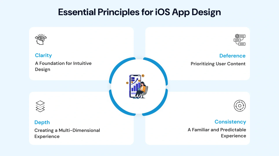
To ensure successful iOS app development, developers must prioritize clarity, deference to content, depth, and consistency in their designs. These core principles are essential for achieving design excellence and complying with App Store guidelines. Accessibility is a legal requirement—ADA and WCAG app design ensures your app works for users with disabilities.
Clarity: A Foundation for Intuitive Design
Clarity is the cornerstone of a well-designed iOS app. It ensures that users can easily understand and navigate the interface without confusion. By adhering to the following guidelines, you can create a clear and intuitive experience:
- Minimalist Design: Avoid clutter by focusing on essential elements and using ample white space.
- Clear Labels and Instructions: Use concise and descriptive language for labels, buttons, and instructions.
- Consistent Terminology: Maintain consistent terminology throughout the app to avoid confusion.
- Visual Hierarchy: Use size, color, and spacing to guide user attention and emphasize important elements.
Deference: Prioritizing User Content
Deference means prioritizing user content. By minimizing distractions and focusing on the app's primary purpose, you can create a more engaging and effective interface.
- Content-Centric Design: Ensure that the app's content is the primary focus, with minimal distractions.
- Fluid Motions: Use smooth animations and transitions to enhance the user experience and make navigation seamless.
- Depth and Dimension: Use layering, shadows, and blurs to visually separate elements and guide user attention, creating a sense of depth.
Depth: Creating a Multi-Dimensional Experience
Depth adds dimension and visual interest to your app, making it more engaging and immersive. By using techniques like layering, shadows, and parallax effects, you can create a sense of depth that enhances the overall user experience.
- Layering: Arrange elements in layers to create a sense of depth and hierarchy.
- Shadows: Use shadows to create a sense of dimension and indicate the relationship between elements.
- Parallax Effects: Introduce subtle parallax effects to create a more dynamic and engaging experience.
Consistency: A Familiar and Predictable Experience
Consistency is vital to a successful iOS app. By maintaining a consistent design language throughout the app, you can create a familiar and predictable experience that reduces user confusion and improves usability.
- Consistent UI Elements: Use consistent UI elements and patterns throughout the app.
- Consistent Typography and Color: Maintain consistent typography and color schemes to create a cohesive visual experience.
- Consistent Interactions: Ensure that user interactions are consistent across different parts of the app.
- Adherence to iOS Design Guidelines: Follow Apple's HIG to ensure consistency with other iOS apps.
iOS App UI/UX Design Guidelines
Apple's Human Interface Guidelines (HIG) provide comprehensive recommendations and instructions for designers and developers to create iOS apps that adhere to Apple's design philosophy.
By following the guidelines, developers can ensure that their apps are consistent with other iOS apps, providing a familiar and predictable user experience. This can help improve app discoverability and adoption.
Key Updates from Apple's HIG:
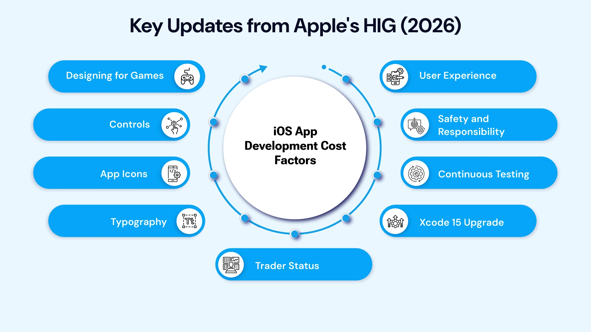
Apple's Human Interface Guidelines (HIG) received significant updates on June 10, 2024, focusing on enhancing the design and user experience of iOS apps. Here are some of the key highlights:
1. Designing for Games:
- Immersive Experiences: The HIG introduced specific guidelines for creating engaging and immersive game experiences on iOS, covering aspects such as game controllers, haptic feedback, and performance optimization.
- Enhanced Player Engagement: These updates aim to help developers design games that are not only visually appealing but also provide a satisfying and enjoyable gameplay experience.
2. Controls:
- Intuitive Interactions: The HIG updated its guidance on designing effective and intuitive controls for various interactions, such as buttons, sliders, switches, and date pickers.
- Improved User Experience: These updates ensure that users can interact with app controls seamlessly and efficiently, enhancing the overall user experience.
3. App Icons:
- Visual Appeal: The HIG provided updated recommendations for creating visually appealing and recognizable app icons that adhere to iOS design principles and stand out in the App Store.
- Brand Identity: These guidelines help UI/UX designers create app icons that effectively represent their app's brand and resonate with users.
4. Typography:
- Choose Wisely: Opt for fonts like Apple's San Francisco, renowned for their clarity and legibility on smaller screens.
- Create Hierarchy: Use different font sizes and weights to establish a clear visual hierarchy, which will guide users through the app's content.
- Consider Accessibility: Ensure that your chosen fonts are accessible to users with visual impairments, including those who rely on screen readers.
5. User Experience:
- Intuitive Navigation: Design navigation that is intuitive and predictable, allowing users to easily find what they need without feeling overwhelmed.
- Seamless Interactions: Ensure that interactions are smooth and responsive, minimizing frustration and enhancing the overall user experience.
- Minimize Cognitive Load: Avoid overwhelming users with excessive information or complex tasks. Streamline the user journey by focusing on essential features and simplifying interactions.
6. Safety and Responsibility:
- Ethical Content: Refrain from including offensive, insensitive, or upsetting content that could harm users' emotional well-being.
- Data Privacy: Prioritize data privacy and security, implementing robust measures to protect user information from unauthorized access or breaches.
- Physical Safety: Design your app to avoid promoting or encouraging activities that could pose a risk to users' physical safety.
7. Continuous Testing:
- Early Detection: Conduct thorough testing throughout the development process to identify and address issues early on, preventing critical bugs from reaching users.
- Iterative Refinement: Embrace an iterative approach, continuously testing and refining your app based on user feedback and analytics.
- Beta Testing: Consider involving beta testers to gain valuable insights from real-world usage and identify potential issues before the official release.
8. Xcode 15 Upgrade
- Compliance: Ensure that your apps are built with Xcode 15 to comply with Apple's requirements for iOS 17, iPadOS 17, tvOS 17, and watchOS 10.
- Leverage New Features: Take advantage of the latest features and improvements in Xcode 15 to enhance your app's performance and functionality.
9. Trader Status:
- Compliance: If you are targeting the European Union market, ensure that your app has trader status to avoid removal from the App Store.
- Understand Regulations: Familiarize yourself with the specific requirements for trader status and the implications of non-compliance.
- Proactive Measures: Take proactive steps to obtain trader status well in advance of the deadlines to avoid disruptions in your app's distribution.
By staying informed about these updates and incorporating them into your design process, you can ensure that your iOS apps align with the latest best practices and deliver exceptional user experiences.
Advanced Design Techniques: Elevating Your iOS App
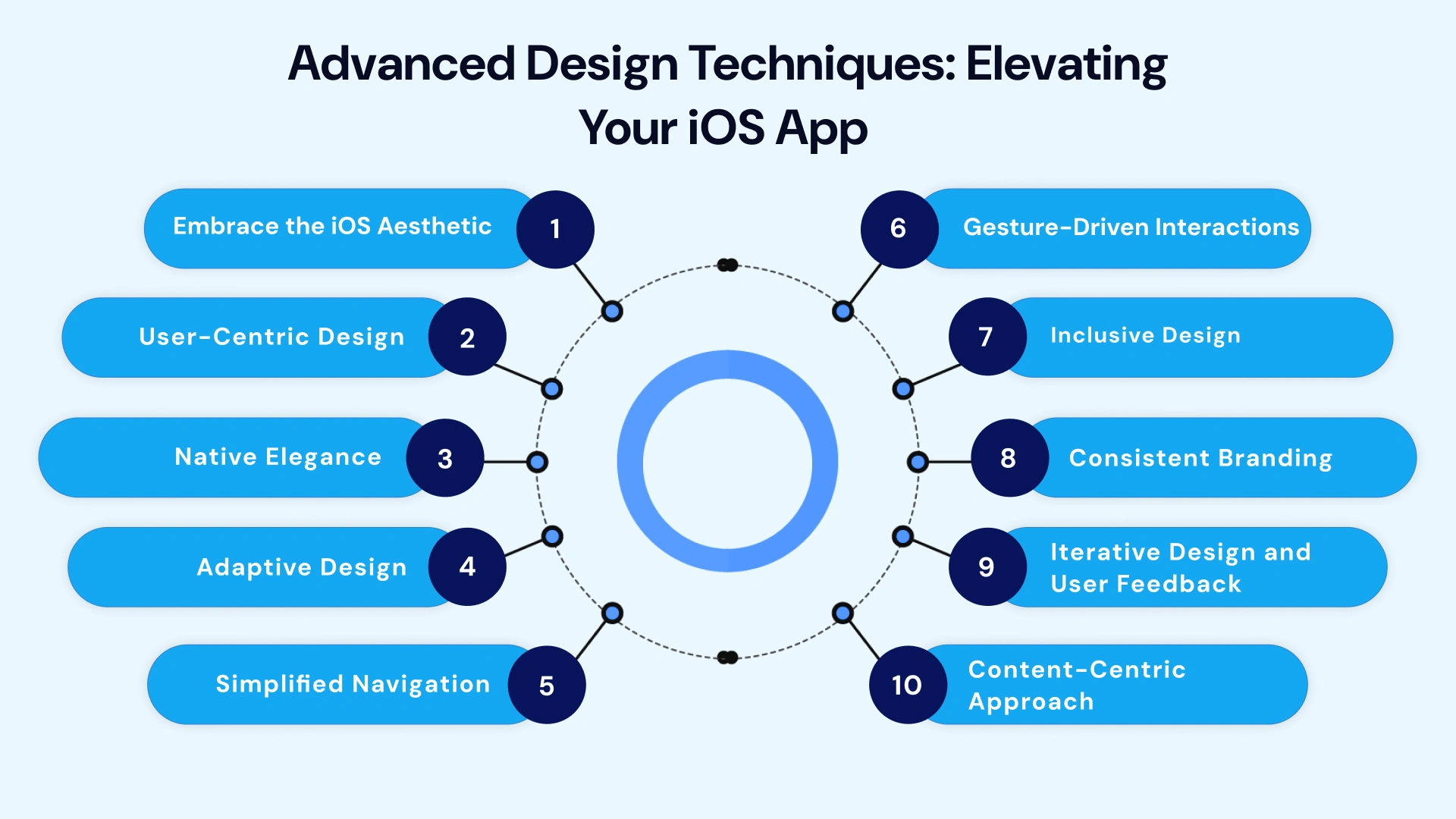
While the core principles and elements discussed earlier form the foundation of a well-designed iOS app, incorporating advanced techniques can elevate your app to new heights.
Let's explore some of the most promising areas:
1. Embrace the iOS Aesthetic:
- Immerse Yourself in iOS: Beyond adhering to the HIG, truly understand the underlying philosophy of UI/UX design. Embrace its minimalist aesthetic, clean lines, and focus on negative space.
- Create Coherent Experiences: Ensure your app's design feels seamlessly integrated into the larger iOS ecosystem, providing a consistent and familiar experience for users.
2. User-Centric Design:
- Empathize with Your Users: Understand your target audience's needs, pain points, and preferences. Conduct thorough user research and leverage insights to inform your design decisions.
- Prioritize Intuitive Interactions: Design for effortless navigation and intuitive interactions, minimizing cognitive load and reducing friction in the user journey.
- Leverage iOS Patterns: Utilize established iOS app UX navigation elements like the tab bar and navigation bar to provide familiar and intuitive experiences.
3. Native Elegance:
- Embrace iOS Components: Leverage iOS's native UI elements to maintain design consistency and provide a familiar user experience. This approach not only speeds up development but also enhances the app's integration into the iOS ecosystem.
- Customizations with Care: While using native components is crucial, consider strategic customizations to differentiate your app while maintaining consistency with iOS design principles.
4. Adaptive Design:
- Seamless Across Devices: Design for a variety of screen sizes and orientations, ensuring a consistent and optimal experience across all iOS devices.
- Responsive Layouts: Employ responsive design principles to adapt your app's layout and content to different screen dimensions without compromising usability.

5. Simplified Navigation:
- Visual Hierarchy: Use visual cues like size, color, and placement to guide users through the app's content and features.
- Intuitive Gestures: Incorporate natural and intuitive gestures that align with iOS conventions, making navigation effortless.
- Clear Labels and Icons: Use descriptive labels and easily recognizable icons to help users understand the purpose of different elements.
6. Gesture-Driven Interactions:
- Leverage iOS Gestures: Integrate iOS-specific gestures thoughtfully to enhance user interactions and provide a more intuitive experience.
- Provide Feedback: Offer visual or haptic feedback to confirm user actions and provide a sense of responsiveness.
7. Inclusive Design:
- Accessibility for All: Design your app to be accessible to users with disabilities, adhering to accessibility guidelines and providing features like VoiceOver and Dynamic Type.
- Diverse User Needs: To create a truly inclusive experience, consider the needs of users with different abilities, cultures, and backgrounds.
8. Consistent Branding:
- Style Guide: Develop a comprehensive style guide that outlines your app's visual identity, including color palette, typography, and UI elements.
- Brand Consistency: Adhere to the style guide throughout the app to create a cohesive and recognizable brand experience.
9. Iterative Design and User Feedback:
- Continuous Improvement: Embrace an iterative design process, gathering user feedback and analytics to identify areas for improvement.
- User Testing: Conduct regular user testing to validate design decisions and ensure the app meets user needs.
10. Content-Centric Approach:
- Prioritize Content: Ensure that your app's content is the primary focus, designing the interface to support and enhance the content's presentation.
- Minimalist Design: Use a minimalist approach to avoid cluttering the interface and distracting users from the content.
By incorporating these advanced techniques and continuously iterating on your design, you can create iOS apps that stand out from the competition and provide exceptional user experiences.
Elevate Your App's Design with VLink Experts
In today's competitive mobile app market, a visually appealing and intuitive design is essential for attracting and retaining users. A well-crafted interface can significantly impact the success of your app. That's where VLink's expert designers come in.
Why Choose VLink
- Deep Expertise: Hire our skilled designers who know the latest iOS design trends and best practices. They deeply understand HIG Guidelines, ensuring your app meets the platform's standards.
- Creative Vision: Our designers bring a creative flair to your project, translating your app's concept into visually stunning designs that captivate your audience.
- User-Centric Approach: We prioritize user experience in all our designs. Our team conducts thorough research and analysis to understand your target audience and create interfaces that meet their needs and preferences.
- Technical Proficiency: VLink designers are proficient in design tools and technologies, allowing them to create high-quality, pixel-perfect designs efficiently.
- Collaboration: Our designers work closely with your development team to ensure a seamless transition from design to development.
Remember, a successful app is not just about aesthetics; it's about delivering value, functionality, and a delightful user journey. If you have any questions or require further assistance with iOS app design, please don't hesitate to Contact Us. Our team of experienced designers and developers is available to provide guidance and support.

Global Delivery Manager, VLink Inc.
Shivisha Patel serves as the Global Delivery Manager at VLink Inc., bringing a wealth of experience in program delivery and management, particularly in the insurance and banking sectors. She has a robust technical background with deep expertise in WebSphere MQ, WTX, IIB, middleware, and enterprise system integration.

 Shivisha Patel


